pro Studios
Way Field Studios is a cutting-edge creative agency that brings innovative designs and strategic solutions to life.
Services
Web design & Web development
Category
Agency website
Client
Marco S Pentaclay

Analysis - Performance and Responsiveness
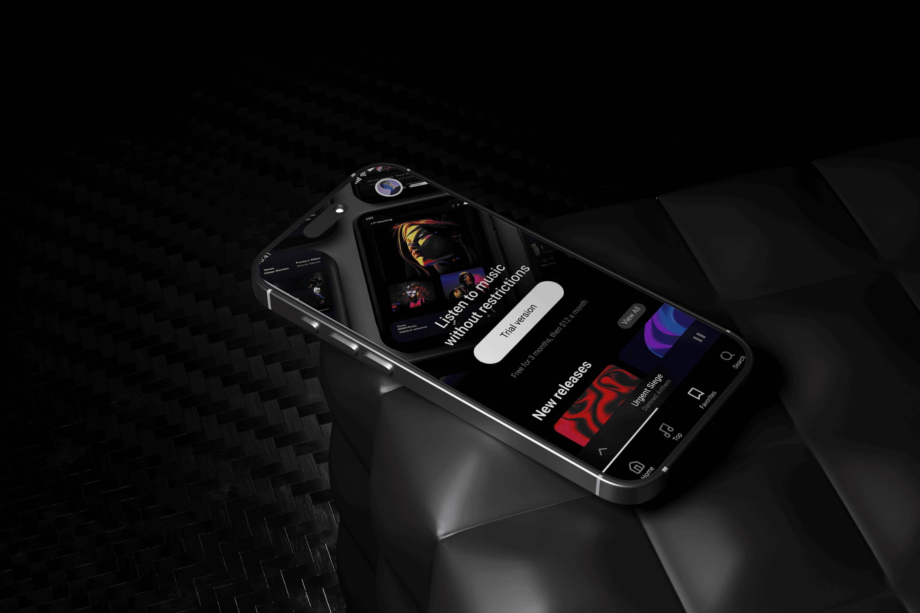
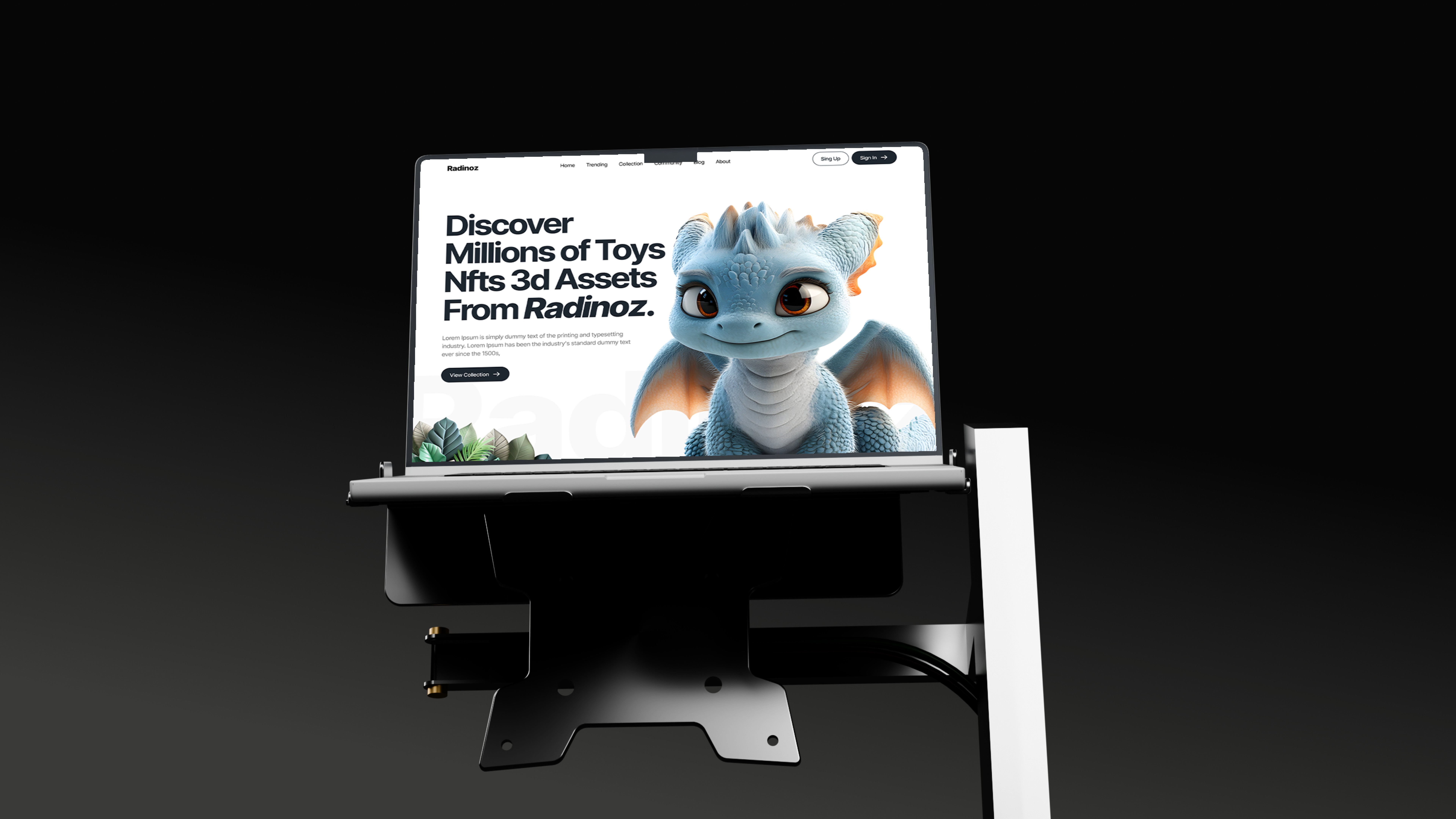
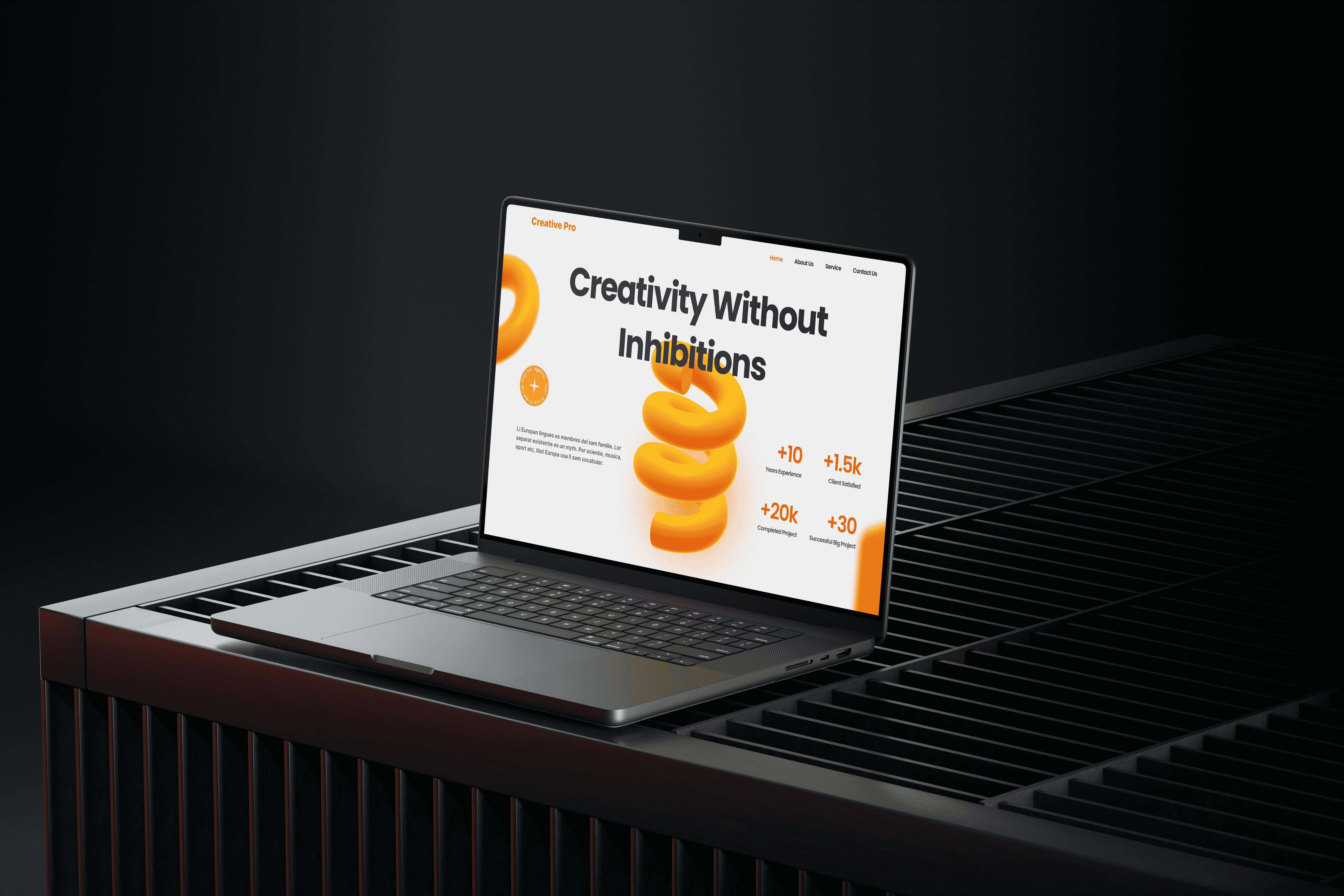
This case study focuses on building a modern, high-performance website with a strong emphasis on responsiveness and usability across devices. The goal was to create a visually clean interface while ensuring fast load times, smooth interactions, and a consistent experience on desktop, tablet, and mobile.
Performance & Optimization
Performance was a key design consideration from the start. Layouts and visual elements were designed to remain lightweight without compromising aesthetics.
Optimized Visual Structure: Minimal UI elements and balanced spacing help reduce visual clutter and improve rendering efficiency.
Efficient Asset Usage: Design decisions were made to support faster loading by avoiding unnecessary heavy graphics.
Scalable Design System: Components were created to scale seamlessly as content or traffic grows, ensuring long-term usability.
Responsive Design Approach
The website was designed using a mobile-first mindset, ensuring adaptability across all screen sizes while maintaining visual hierarchy and clarity.
Flexible Grid System: Layouts adapt smoothly from small screens to large displays without breaking content flow.
Consistent User Experience: Typography, spacing, and interactions remain uniform across devices.
Touch & Desktop Friendly Interactions: Buttons, navigation, and components are optimized for both touch and cursor-based usage.


Problem – Usability & Responsiveness Challenges
The primary challenge addressed in this case study was improving the overall usability and responsiveness of a modern website while maintaining visual clarity and performance. Existing design patterns often struggle with inconsistent layouts, poor adaptability across devices, and unclear content hierarchy, which negatively impacts user experience.
Design Focus
The goal was to resolve these challenges by creating a clean, responsive, and performance-conscious interface that works seamlessly across devices. The focus was on simplifying layouts, improving adaptability, and ensuring a consistent user experience without compromising modern aesthetics.

Solution – Design Strategy & Execution
To address the identified usability and responsiveness challenges, the solution focused on creating a scalable, modern design system that balances visual clarity, performance, and adaptability across devices. Every design decision was made with real-world usage and long-term flexibility in mind.
Design Approach
The solution was executed through a structured and iterative design process:
Mobile-First Design: Layouts were designed starting from smaller screens and progressively enhanced for larger devices to ensure consistency and usability.
Clean Visual Hierarchy: Typography, spacing, and color usage were refined to guide users naturally through the content.
Component-Based System: Reusable UI components were created to maintain consistency and improve scalability.
Performance-Conscious Design: Lightweight layouts and simplified visuals helped support faster load times and smooth interactions.
Result
The final solution delivers a modern, responsive website that feels intuitive, performs efficiently, and maintains visual consistency across devices. The design successfully bridges aesthetics and usability, resulting in an engaging and scalable user experience.